
OVERVIEW
The MTA oversees a massive system used by travelers of a range of mobilities in NYC; yet, not all subway stations can be used by everyone. This is because there is a great disparity in the MTA’s accessible stations—not just in number, but in location, as well.
According to an article on NYC’s subway system in the New York Times, I had read that “more than 75 percent of the city’s 472 subway stations do not have elevators, lifts or other methods that make them accessible for people who use wheelchairs, mobility devices or are otherwise unable to use stairs.” This project used Kepler.gl and location data for the MTA’s accessible stations downloaded from Open NY to create a map comparison highlighting the differences.
Why Map ADA and non-ADA Stations?
Accessibility can be measured in many different ways. One standard in the United States is to follow ADA guidelines. ADA stands for the Americans with Disabilities Act, which has standards for accessible design (and not just for physical spaces, but online as well!)
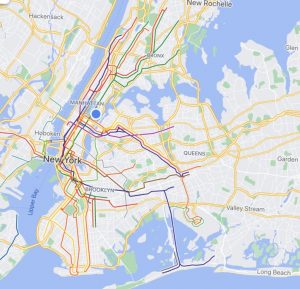
The next three images show why this project is so impactful. For those not familiar with the geography of New York City, it is comprised of five boroughs (think of it as breaking up a huge city into five huge communities): The Bronx, Brooklyn, Manhattan, Staten Island, and Queens. For reference, the GDPs of each borough in descending order for 2012 was: Manhattan – $600 billion, Queens – $93 billion, Brooklyn – $92 billion, Bronx – $43 billion, and Staten Island – $14 billion.
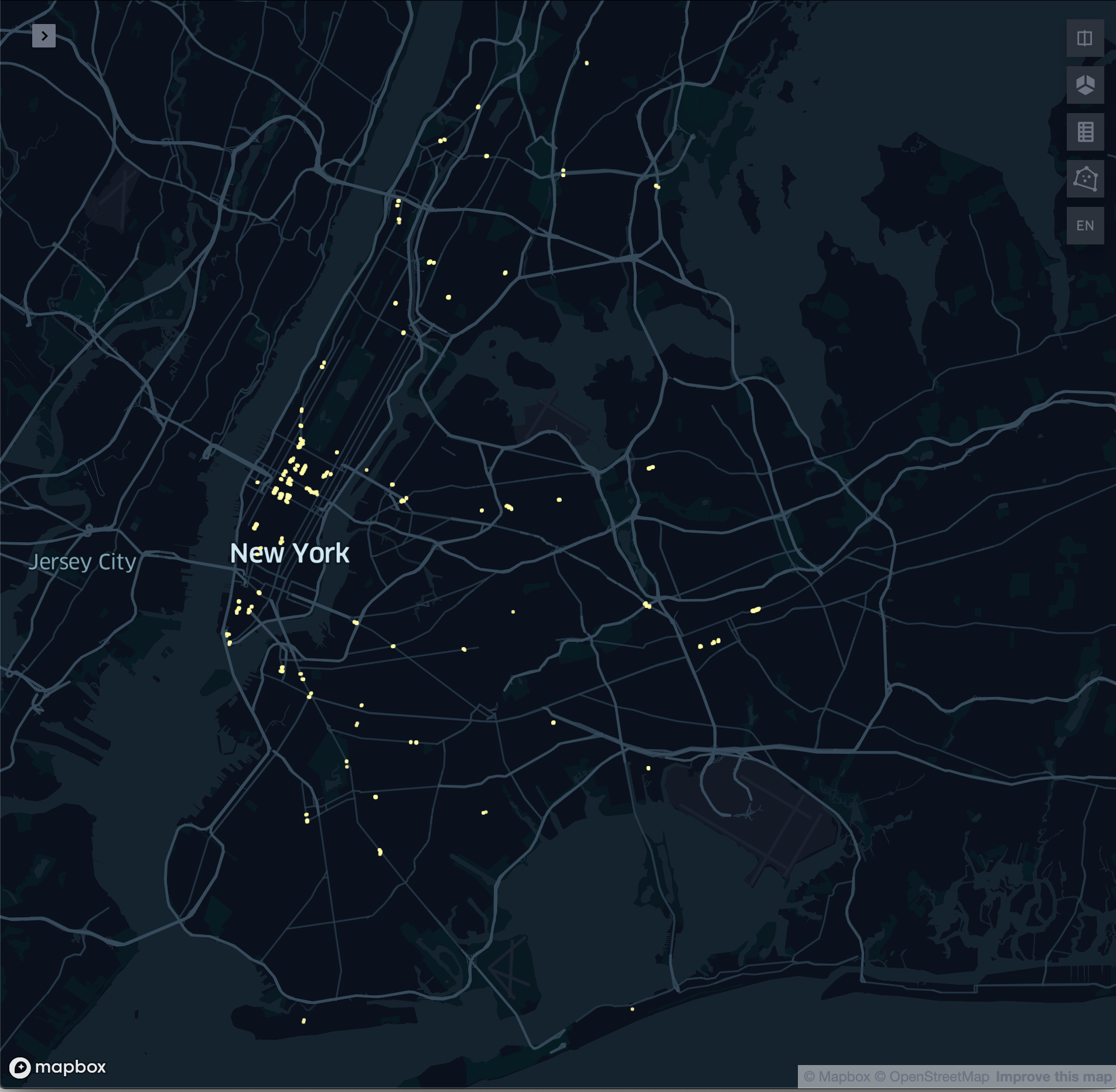
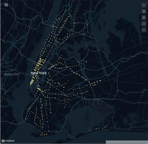
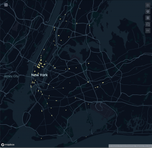
First is a map of the New York City area with the boroughs labeled, followed by the two maps I produced: a map of the city with all MTA entrance and exit locations marked, then a map the city with only the ADA-compliant MTA entrance and exit locations marked.
Process
Because New York State has laws requiring public information be publicly available and accessible, I was able to download a list of all the subway station entrance and exit locations (with latitude & longitude) and whether they are ADA-compliant.

For efficiency in processing the data to create the maps, I divided the locations marked “TRUE” and “FALSE” into separate files and then upload them info Kepler.gl to produce the maps above, changing filters and icons to produce the results in the maps above. The location of the vast majority of ADA-compliant subway stops is striking–with only a small number of ADA-compliant stations located in the less-wealthy boroughs, compared to Manhattan.
Takeaways
This project was done in April 2020, as I was still learning how to code in JavaScript (and at the start of the pandemic.)
While I initially had hoped to push myself with deep, boundary-pushing issues and complicated mapping projects for my All Maps Lie course at NYU’s Interactive Telecommunications Program, the reality was that:
- there are many rabbit holes to go down when you know just enough code to be dangerous; that said, there are also many options for beginners, and
- using datasets on issues which are deeply personal can produce visualizations that appear simple while still being very impactful.