OVERVIEW
For this project, I designed a customized compass that would allow users to navigate more freely and efficiently to the nearest ADA-complaint subway station in NYC.
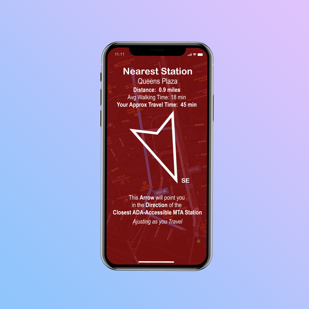
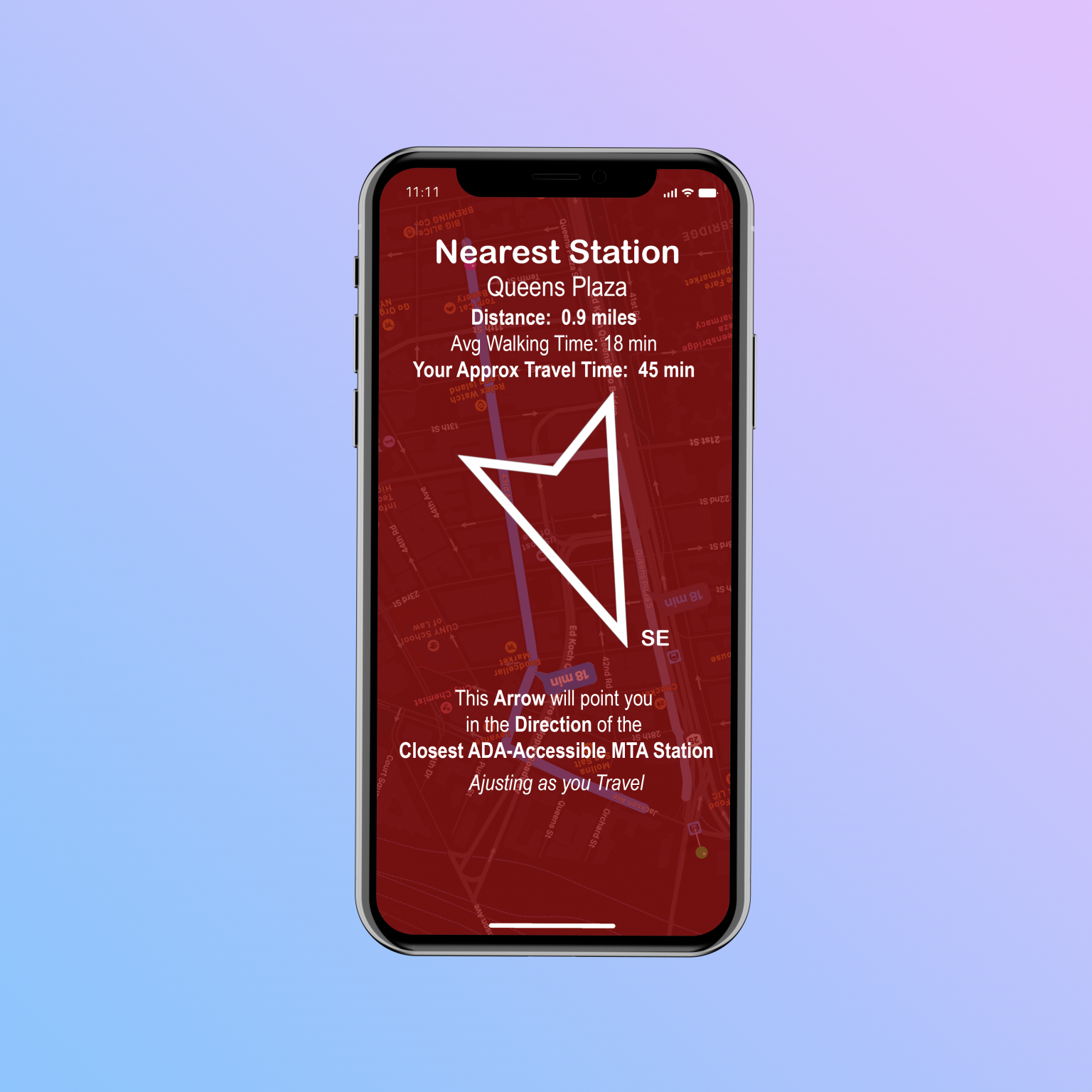
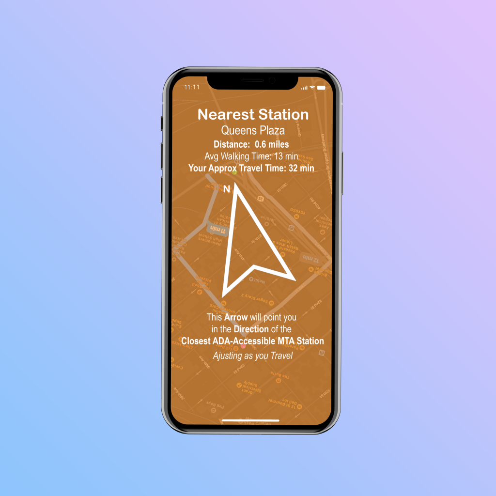
For this compass, users would download an app that would access their location and point them in the direction of the closest ADA-compliant MTA subway station. As the user moves, she will be displayed an arrow fixed in the direction of the ADA station—giving the user the option to assess the state of the sidewalks, crowds, and surrounding construction, then choose the best way to proceed, without losing her bearings. The app would also allow users to modify their travel speed and recalculate the approximate travel time.
Why a Customizable Compass?
Considering how people of different mobilities travel the streets and sidewalks of NYC, it makes since that every stretch of terrain between street corners is an opportunity for an obstacle.
By creating a compass that orients users toward the closest ADA-compliant station, travelers can avoid obvious hurdles while still heading in the direction of their desired ADA-compliant subway entrance. By factoring into account a customized rate of travel based on mobility, users of the compass can better pace themselves.
Process
In order to power the customized compass, the app would use the user’s location to find the closest ADA-compliant station, pulled from a list that is updated through Open NY’s (New York State’s Data Portal) API. For my project, I’m using the dataset called NYC Transit Subway Entrance And Exit Data. The app would call on a maps app’s API (such as Google Maps) to determine the (usually, three) best ways, displaying that below a color filter indicating distance and Approximate Travel Time.
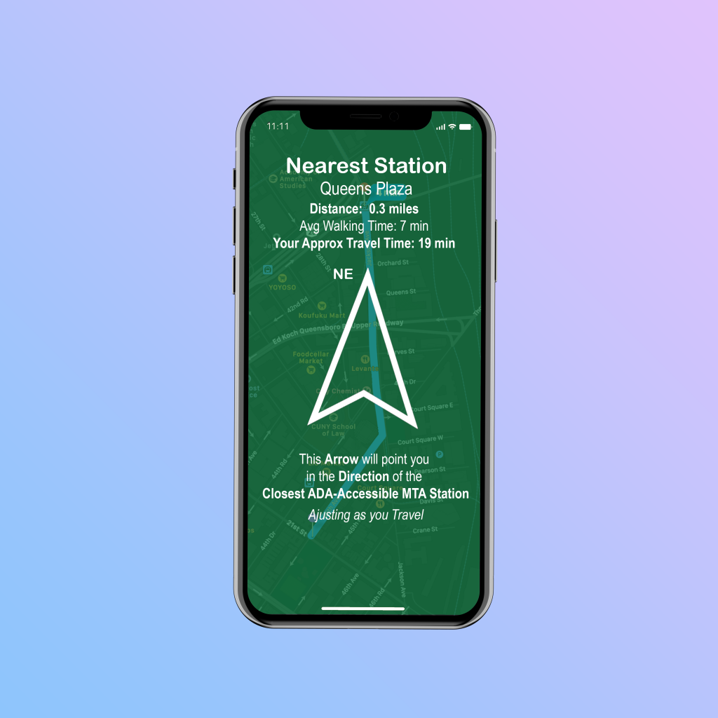
Along with the color-coded background (Green for under-20 min, Orange for 20 to 40 min, and Red for over-40 min… these are adjustable in settings) with underlying map. compass arrow, and average walking time, the screen displays the name of the station, the cardinal direction, and a customized Approximate Travel Time.
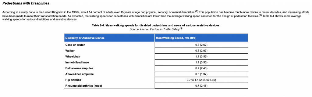
To get the customized travel time for the user, there is an available adjustable control. This control allows people to input their approximate travel rates. They can do so by using selecting an average speed based on different conditions—such as age, disability, mobility issues—and will have the ability to have the system calculate a customized Approximate Travel Speed. This will work by having users opt-in to different trips of theirs (which they feel are representative of their average rates of travel–i.e. no major delays or stops for coffee & pastries) for an Approximate Travel Speed to be calculated.
After five trips, the user’s adjusted Approximate Travel Speed will be applied and users will be asked from time to time if the app’s estimates are accurate for them. If they answer no, they will have the chance to select more future (representative) trips to be factored into their Approximate Travel Speed; users will always have the option to reset this at any time. Additionally, the users will be given the option for different Approximate Travel Speeds to allow for things like city vs suburban/rural travel, use of manual wheelchair vs electric wheelchair/cane, or who will be assisting them.
Takeaways
With all the data publicly available out there, using software can turn the device in your pocket into a powerful navigation device. This project was just a portion of the development process for such an application; there’s the actual coding, UX testing, and refinement for starters. Nevertheless, this project shone a light on a small, yet important slice of what it takes to produce such a piece of software—including all the work required to learn about available resources to tap into, designing user-friendly interfaces, and determining which features to promote for the best overall experience.